The vast field of data visualization is adorned by many intriguing elements and techniques that help in representing abstract, complex data into easily digestible, interpretive graphical formats. One such significant element in data visualization is the box plot. In this article, we will delve deep into the realm of box plots and look at their applications and importance in the contemporary world of analytics and data science. Keep reading to learn more about the box plot explained.
The Concept of Box Plots
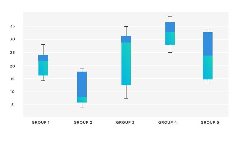
A box plot, also known as a box-and-whisker plot, is a statistical visualization tool that displays the distribution of a dataset. It provides a visual representation of the minimum, maximum, median, and quartiles of the data, giving a concise summary of its central tendency and spread.
The plot consists of a rectangular “box” that signifies the interquartile range (IQR), which is the range between the 25th and 75th percentiles of the data. The median is represented by a horizontal line inside the box. The “whiskers” extend from the box to the minimum and maximum values of the dataset, excluding any outliers. Outliers, if present, are represented as individual data points beyond the whiskers.
Box plots are particularly useful when comparing multiple datasets or groups of data. By placing multiple box plots side by side, it becomes easy to observe differences in central tendency and variability among the groups.
Advantages of Box Plots
In the world of data visualization, box plots have carved a niche for themselves due to their multi-dimensional advantages. They step up as an excellent tool when it comes to comparisons between different data sets. Their structure allows a quick examination of central tendencies, variance, and detection of outliers within numerous sets of data. This enables researchers, analysts, and statisticians to draw reliable conclusions from their data and render responsive decisions.
Box plots also shine brightly when comparative studies have to be made. They need less space than other plots, allowing for multiple box plots to be placed in the same graph for easy comparison. As such, they are ideal for comparing datasets of similar nature or datasets that share the same units or scale.
Box plots serve as a significant tool in identifying skewness in the data. The asymmetry in the box, or the unequal lengths of the whiskers, indicates the skewness, giving insights into the data distribution. Furthermore, box plots do this while using less ‘graphical real estate,’ significantly reducing the complexity of understanding the data.
Embracing Box Plots in Today’s Data-Driven World
The adoption of box plots has been widespread in our increasingly data-driven world. They are regularly used in exploratory data analysis— a crucial step in any statistical study. Business analysts frequently use these plots to gain a quick understanding of how the values in a dataset are spread out, aiding in the data-driven decision-making process.
The application of box plots extends to the diverse scientific world as well. Researchers use them for comparison of experimental results, correlation of patterns, and detection of outliers. In addition, in the educational sphere, box plots serve as an effective tool for teaching statistical concepts to students.
The essence of box plots transcends beyond any particular field or sector. Its simplicity, visual clarity, compactness, and ease of use make it a versatile tool in the data visualization arsenal.
Box Plots and Big Data
As we step into the era of big data, the importance of box plots is multiplied manifold. With vast volumes of data being generated every second, the need to quickly review data distribution, detect outliers, and compare different data sets will become increasingly essential in every industry.
In the backdrop of this ever-growing data, box plots are evolving, accommodating new modifications to handle large data more efficiently. Variants of the box plot, like the notched box plot and violin plot, have already begun gaining traction. These variants imbibe the basic principles of traditional box plots and enhance them to bring in a more nuanced perspective of the data.
Overall, box plots, with their simplicity, versatility, and rich information, provide an efficient way to understand and interpret data. Their usage spans across different fields, reaffirming their significance in the world of data visualization. While they do have limitations, the multiplicity of their advantages makes them an essential tool for anyone working with data.


